
(URL: http://stock-images.antiqueprints.com/images/sm0004-WorldKitchin1777.jpg)
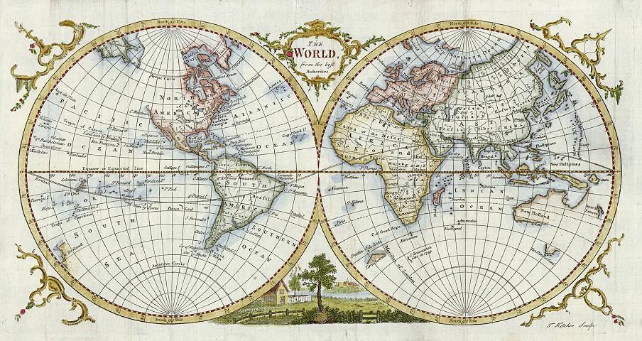
Thomas Kitchin engraved unto a copper plate this image of the world, which was then published in Guthrie's New Geographical Grammar, circa 1770. Ink was applied to the engraved image, which was then pressed unto parchment, and later colored in. The map depicts the Western and Eastern Hemispheres of the world and separates them into conjoined, yet distinct, entities. In including latitudinal and longitudinal references, the map is defining absolute locations, in which a reference system is used to locate places. Thus, the explicit purpose of this map is to present a realistic representation of the world, yet it contains subtle details that hint of political refrains. For instance, there are portions of the map that are not included. The Northwest territory of North America, a portion of present-day Australia, as well as all of Antarctica are omitted, suggesting that these areas did not fall under British hegemony. It is important to note that the center of the map is deliberately not England, which is depicted as a small island nation. William Guthrie, an emerging figure from the Scottish Enlightenment, questioned the Anglo-centric perspective that dominated the worldview of the 17th and 18th Centuries. By providing a map aimed at accurately portraying the world, Guthrie challenged the notion of British supremacy. His map is entitled "The World from the Best Authorities", which explicitly challenges British authority.
(2) "World Mapper Project: Net Immigration"

(URL: http://blog.craigkapp.com/wp-content/uploads/2009/01/17.png)
The University of Sheffield, which is located in the United Kingdom, created graphic distortions of a regular map to highlight different characteristics of the world's nations. In the above map, relative differences in net immigration are shown. The larger the shape of the country, the larger the relative figure of net immigration that nation has. Countries that are not even displayed on the map, such as a few South American countries, have a net emigration, or more people are leaving the country than entering it. Net migration is measured as the total number of people entering the country subtracted by the total number of people leaving the country. From the map, it can be discerned that the United States, Western Europe, and the Middle East have the largest figures of net immigration. A possible correlation that can be drawn from this map is that richer areas seem to have larger figures of net immigration. The reason for such a trend may be that places that are more affluent generate pull factors that draw people from less affluent places.
(3) "Crime Topography of San Francisco"

(URL: http://strangemaps.files.wordpress.com/2010/06/right_500_2.jpg)
These maps were produced by Douglas McCune, who used data collected on crime in the city proper of San Francisco. The city was divided into grids of the same area. Looking at eight different forms of lawbreaking, McCune used records of their spatial location and the number of those criminal offenses to create a unique topographic view of San Francisco. What is being shown is not the famous hills of SF, but rather the levels of different crimes. The higher the peak, the greater the level of crime in that particular area. Some crimes are more widespread, while others are much more concentrated in specific areas. For example, vehicle theft and larceny encompass the entire city, whereas prostitution occurs mainly in the Tenderloin District. These maps are useful in strategically targeting certain crimes as well as knowing where to place scarce police resources to prevent the most amount of crime.
No comments:
Post a Comment